Executive reports, available for Diamond-level, SAT Foundation, and SAT Advanced subscriptions, provide a central location for the data that is most important to you and your accounts. Executive reports are made up of widgets that allow you to display your organization’s phishing, training, and Risk Score metrics. You can also add supporting titles, subtitles, text, and tables. You can also save, print, and schedule your executive reports.

Navigating Executive Reports
To learn how to navigate the Executive Reports subtab, read the list below:

- In the top-left corner of the subtab, a drop-down menu lists three system report templates and all of your saved reports. Select a report name to view, edit, print, or schedule that report.
- Edit Report: You can edit nearly every aspect of your report, from the accounts included to how the widgets are organized on the page. For more information, see the Report Editor section of this article.
- Create Report: From this drop-down menu, you can create a new report or make a clone of the report you are currently viewing.
- Print: Click this button to generate a PDF file version of this report. When the report is ready, click the notification bell in the top-right corner to download the PDF file. For more information, see the Partner and Multi-Account: Download Center Guide. This report will be downloaded in the language set in your account settings.
- Schedule Report: This option allows you to send this report to members of your organization on a recurring basis. For more information about this process, see our Partner and Multi-Account: Save and Send Reports article.
To delete a created report, first click Edit Report. Then, click Delete Report in the top-right corner of the page. System report templates cannot be deleted.

System Report Templates
System report templates are premade reports that you can use or clone for your own purposes. To edit the template you are viewing, click Create Report and select Clone Report. Then, customize the cloned report to your liking. For more information, read the Report Editor section of this article. Read the list below to learn more about each template:

In the top-left corner of the Executive Reports subtab, you’ll find the system report templates listed below:
- Security Admin Report: Security administrators may want to track risky behavior, trends, and improvements over time. Widgets on this report show data such as training progress by department and phishing test results over time.
- CISO Report: A CISO may want to track an organization as a whole. Widgets in this report show data such as Risk Score trends and Phish-prone Percentages by organization.
- Team Manager Report: Managers may want to track the behavior of each member of their team. Widgets in this report show data such as training completion and Risk Score by user.
Report Editor
On the report editor page, you can add widgets, select your report settings, and preview your executive report. For more information, read the list below:

- Report Name: We recommend giving your report a short but descriptive title in this field.
- Widgets: Click on a widget button to add one to your report. You can add numerous widgets of the same type and edit them to fit your needs. For more information, read the Executive Report Widgets section of this article.
- Filters: In this section, you can edit the timeframe, font, included accounts, and PDF layout.
-
PDF Layout: From this drop-down menu, you can select Automatic or Manual formatting.
- If you select Automatic, the PDF file will be in landscape orientation.
- If you select Manual, the PDF file will be in portrait orientation, and the Preview PDF button will display at the top-right corner of this page. Click Preview PDF to see how the widgets align onto pages for printing. You can also resize and rearrange widgets while in this preview mode.
Once you have customized your executive report, click Save Changes in the top-right corner of the page.
Formatting Widgets
Widgets allow you to customize what data is shown and how it is displayed. Read the list below to learn how to format widgets:

- To customize a widget, click the gear icon in the top-right corner of the widget.
- To remove a widget, click the X icon in the top-right corner of the widget.
- To resize a widget, click and hold the triangle in the bottom-right corner of the widget. Then, drag your cursor, and the widget will adjust in real time.
- To move a widget, click on the widget and drag it to another area of the page.
- To download a widget, click the three-line icon in the top-right corner of the widget.
Executive Report Widgets
Each executive report is made up of highly customizable widgets. There are two text-based widgets: Title & Logo and Text Block. There are also three report-based widgets, which are listed below:
- Training Metrics: This widget includes a graph or table customized with training activity, such as time spent on training, training status, and assigned content. This data can be grouped and filtered by criteria like account, organization, and progress status.
- Phishing Metrics: This widget includes a graph or table customized with phishing data such as Phish-prone Percentage, reported phishing tests, and phish failure types. This data can be grouped and filtered by criteria like account, organization, and email template.
- Risk Score Trend: This widget includes a graph, table, or gauge displaying the Risk Score based on criteria like account, organization, and date range.
To learn more about each widget, read the subsections below.
Title & Logo Widget
By default, the Title & Logo widget includes who generated the report, the date, and your organization’s logo. You can use the text editor to write and format your own text.
The Show Logo checkbox at the top of the page uses the company logo that has been uploaded to your account settings. For more information, see our article titled Add Your Company Logo, Logo URL, and Brand Color to Your Console.
When you’re finished customizing your widget, click Apply Changes in the bottom-right corner of the window.

Training Metrics Widget
To learn how to customize the Training Metrics widget, read the list below:

- By default, each widget uses the Report Settings selected. To change the Timeframe field, enable the toggle in the blue banner at the top of the window.
- Value Type: Select the value to display in this widget, such as total time spent or percentage complete.
- Category: Select how the data is sorted, such as by enrollment date or account.
- Grouped By: Select how the data is grouped on this widget, such as by account or training campaign.
- Accounts: If you have enabled the toggle at the top of the page, you can select different accounts to display on this widget.
- Title: Enter a title for your graph or table.
-
Chart Type: Select how to display the data on this widget, such as in a table, bar graph, or pie chart.
- When using a table, you'll find two more options under Additional Filters:
- Show totals for Category selection: Use this filter to calculate a total for the variable selected from the Category drop-down menu.
- Show totals for Grouped By selection: Use this filter to calculate the total for the variable selected from the Grouped By drop-down menu.
-
If the value type includes percentages, the total is displayed as a weighted average. This weighted average considers multiple factors, such as how many pieces of content are in a training campaign.
Note: We use weighted averages because a simple average could be misleading. Simple averages treat all percentages the same, regardless of the number of users in a campaign. The weighted average considers the number of users involved and more accurately represents the information.
- When using a table, you'll find two more options under Additional Filters:
- Include Archived Users: Enable this setting to include archived users in your graph or table.
- Include items with blank values: Enable this setting to display items that have blank values for your selected criteria. For example, if you select Department as a category, users without a department listed will be included.
- Include Trend Line: Enable this setting to display a linear trend line over your line graph, showing the overall direction of data. This option is only available for line graphs.
- Top Results: Use this drop-down menu to display only the top 5, 10, or 100 results for your selected criteria. All results are displayed by default.
- Date Interval: Use this drop-down menu to select the date range you would like to group your data by.
- Training Additional Criteria: Use this drop-down menu to select additional criteria for the Training Campaigns drop-down menu below. You can select Campaign Training, Optional Learning, or AIDA Optional Learning.
-
Training Campaigns: Use this drop-down menu to select one or more campaigns to include in this report.
Note: At this time, partner and multi-admin accounts are unable to support the selection of specific campaigns. - Timeframe: Select a start and end date for your executive report.
When you’re finished customizing your widget, click Apply Changes in the bottom-right corner of the window.

Phishing Metrics Widget
To learn how to customize the Phishing Metrics widget, read the list below:

- By default, each widget uses the Report Settings selected. To change the Timeframe filter, enable the toggle in the blue banner at the top of the window.
- Value Type: Select the value to display in this widget, such as Phish-prone Percentage or the total count.
- Category: Select how the data is sorted, such as by phishing test result or organization.
- Grouped By: Select how the data is grouped on this widget, such as by account or phishing campaign.
- Accounts: If you have enabled the toggle at the top of the page, you can select different accounts to display on this widget.
- Title: Enter a title for your graph or table.
-
Chart Type: Select how to display the data on this widget, such as in a table, bar graph, or pie chart.
- When using a table, you'll find two more options under Additional Filters:
- Show totals for Category selection: Use this filter to calculate a total for the variable selected from the Category drop-down menu.
- Show totals for Grouped By selection: Use this filter to calculate the total for the variable selected from the Grouped By drop-down menu.
-
If the value type includes percentages, the total is displayed as a weighted average. This weighted average considers multiple factors, such as how many users have received a specific Phishing Security Test.
Note: We use weighted averages because a simple average could be misleading. Simple averages treat all percentages the same, regardless of the number of users in a campaign. The weighted average considers the number of users involved and more accurately represents the information.
- When using a table, you'll find two more options under Additional Filters:
- Include Archived Users: Enable this setting to include archived users in your graph or table.
- Include items with blank values: Enable this setting to display items that have blank values for your selected criteria. For example, if you select Department as a category, users without a department listed will be included.
- Include Trend Line: Enable this setting to display a linear trend line over your line graph, showing the overall direction of data. This option is only available for line graphs.
- Top Results: Use this drop-down menu to display only the top 5, 10, or 100 results for your selected criteria. All results are displayed by default.
- Date Interval: Use this drop-down menu to select the date range you would like to group your data by.
- Timeframe: Select a start and end date for your executive report.
When you’re finished customizing your widget, click Apply Changes in the bottom-right corner of the window.

Risk Score Trend Widget
To learn how to customize the Risk Score Trend widget, read the list below:

- By default, each widget uses the Report Settings selected. To change the Timeframe for this widget, enable the toggle in the blue banner at the top of the window.
- Value Type: By default, Risk Score is automatically selected. For more information about Risk Score, see our SmartRisk™ Engine and Risk Score Guide.
- Category: Select how the data is sorted, such as by calculated on or account.
- Grouped By: Select how the data is grouped on this widget, such as by account or location.
- Accounts: If you have enabled the toggle at the top of the page, you can select different accounts to display on this widget.
- Title: Enter a title for your graph or table.
- Chart Type: Select how to display the data on this widget, such as in a table, bar graph, or gauge.
- Include Archived Users: Enable this setting to include archived users in your graph or table.
- Include items with blank values: Enable this setting to display items that have blank values for your selected criteria. For example, if you select Department as a category, users without a department listed will be included.
- Include Trend Line: Enable this setting to display a linear trend line over your line graph, showing the overall direction of data. This option is only available for line graphs.
- Top Results: Use this drop-down menu to display only the top 5, 10, or 100 results for your selected criteria. All results are displayed by default.
- Date Interval: Use this drop-down menu to select the date range you would like to group your data by.
- Timeframe: Select a start and end date for your executive report.
When you’re finished customizing your widget, click Apply Changes in the bottom-right corner of the window.

Text Block Widget
By default, the Text Block widget includes a list of recommendations for building a strong security awareness program. This widget is a free-form text field where you can add text, tables, images, links, and more. You can also copy and paste information directly into this field. Read the list below for ideas on how to use this widget:
-
Link to other relevant reports or documents.

-
Link to other areas of the KnowBe4 console.

-
Explain key concepts and link to knowledge base articles.

-
Provide details about compliance requirements and best practices.

PAB Activities Widget
To learn how to customize the PAB Activities widget, read the list below:
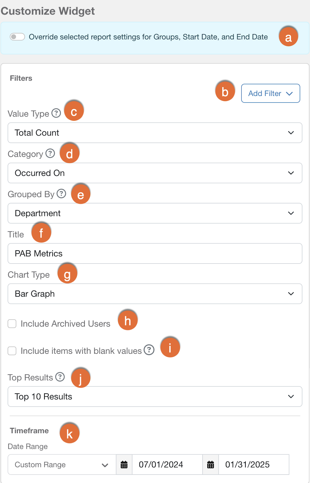
- By default, each widget uses the Report Settings selected. To change the Timeframe field, enable the toggle in the blue banner at the top of the window.
- Add Filter: Click this button to add more filters for your PAB widget.
- Value Type: Use this drop-down menu to select the value type you would like to view for your selected criteria. For example, you can view the total count of how many times the PAB was used.
- Category: Use this drop-down menu to select the category you would like to view data for. For example, you can view data for your PAB version or PAB configuration.
- Grouped By: Use this drop-down menu to select how you would like to group data for your selected category. For example, you can group data by email address for each department.
- Title: Enter a title for your graph or table.
-
Chart Type: Use this drop-down menu to select how you would like to display your data.
- When using a table, you'll find two more options under Additional Filters:
- Show totals for Category selection: Use this filter to calculate a total for the variable selected from the Category drop-down menu.
- Show totals for Grouped By selection: Use this filter to calculate the total for the variable selected from the Grouped By drop-down menu.
-
If the value type includes percentages, then the total is displayed as a weighted average. This weighted average considers multiple factors, such as how many pieces of content are in a training campaign or how many users have received a specific Phishing Security Test.
Note: We use weighted averages because a simple average could be misleading. Simple averages treat all percentages the same, regardless of the number of users in a campaign. The weighted average considers the number of users involved and more accurately represents the information.
- When using a table, you'll find two more options under Additional Filters:
- Include Archived Users: Enable this setting to include archived users in your graph or table.
- Include items with blank values: Enable this setting to display items with blank values for your selected criteria. For example, this setting could allow users without a value in the Department field to display in the widget.
- Top Results: Use this drop-down menu to display only the top 5, 10, or 100 results for your selected criteria. All results are displayed by default.
- Date Range: Select a timeframe for your widget.