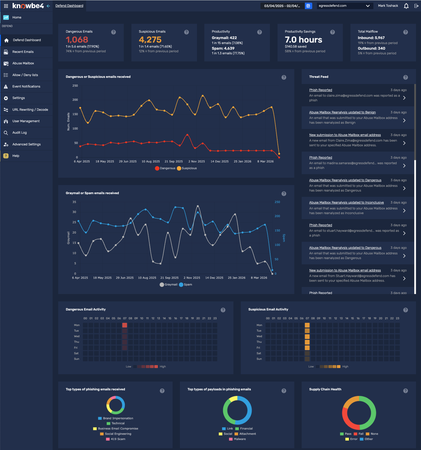
The dashboard screen provides an overview of the email activity observed by Defend. This information is displayed in easy-to-read graphs and charts. A side menu also allows you to navigate to other areas of the portal.
Navigation Menu
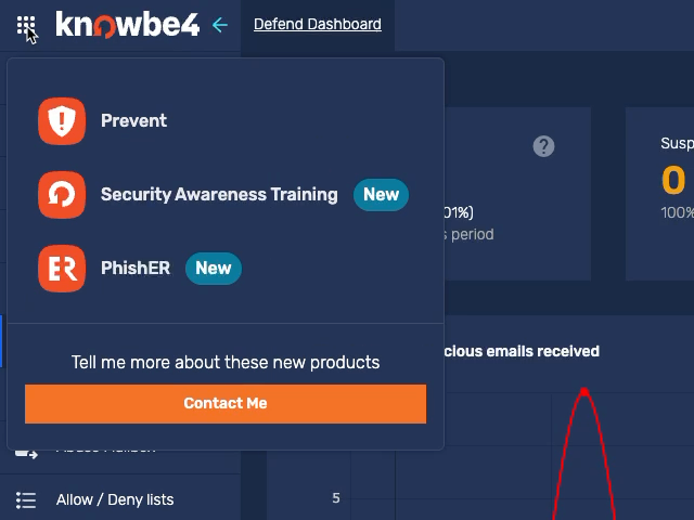
By selecting the navigation menu at the top-left corner of the page, you can navigate to other KnowBe4 products, including Prevent, PhishER, and KSAT. For more information, see our Login Page and Navigation Menu Overview article.
Timeline
By default, the timeline displayed is two weeks before the current date. This section can be altered at the top-right corner of the screen with the following settings:
- Day
- Week
- Month
- Quarter
- Year
- Custom Range
Email Totals
At the top of the Dashboard screen, a selection of boxes displays counts and trends for the selected timeline.
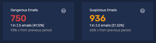
The Dangerous Emails and Suspicious Emails options are clickable. Selecting either of them will take you to a filtered view of the Recent Emails page and show you the individual emails detected in the time period. You can select these emails to see more information.
The Graymail Emails and Spam Emails options show the number of emails being flagged in the selected timeframe and are clickable cards. Selecting either of them will take you to a filtered view of the Recent Emails page and show you the individual emails detected in the time period. You can select these emails to see more information.
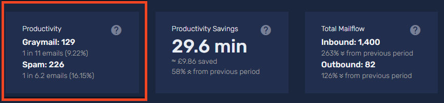
The Productivity option combines counts for emails that were flagged as spam or graymail. This option helps you understand how much of your organization's total email volume reduces productivity.
The Productivity option displays the following metrics:
- Graymail: The total number of graymail emails received during the selected time period.
- Spam: The total number of spam emails received during the selected time period.
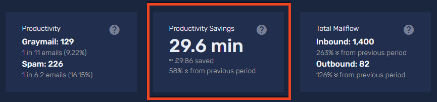
The Productivity Savings option shows the estimated time and money your organization saved by filtering spam and graymail. This metric helps you quantify the return on investment (ROI) of your email security.
We calculate the time saved by multiplying the number of filtered emails by the average time saved per email. The card dynamically displays this value in seconds, minutes, hours, or days. We calculate the cost saved by multiplying the total time saved by the average employee's hourly wage.
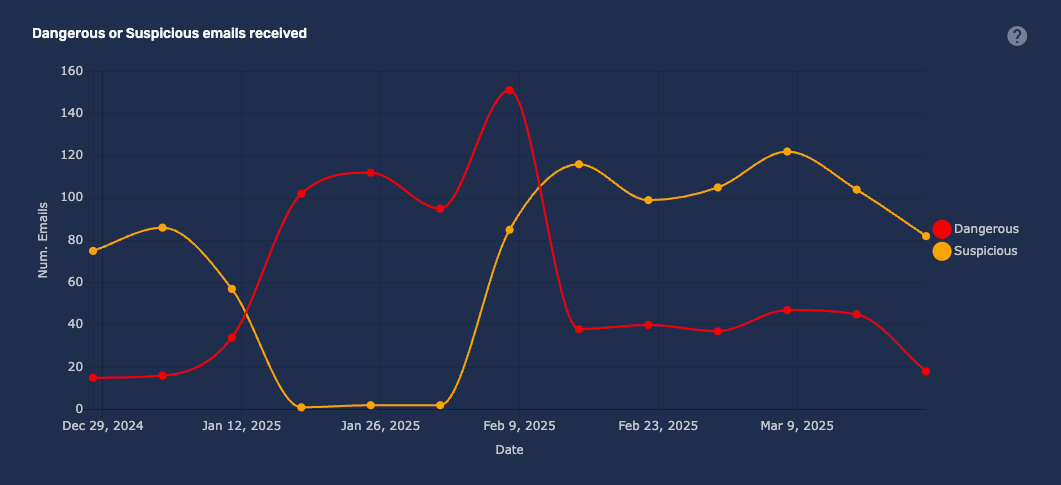
Dangerous or Suspicious Emails Received
This graph displays the count of emails classed as Dangerous or Suspicious in real time for the selected timeframe. The data points are interactive. Clicking on them will take you to a filtered view in Recent Emails.
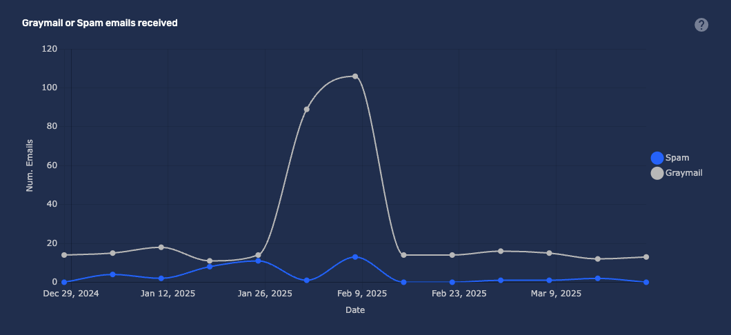
Graymail or Spam
This graph displays the count of emails classed as Graymail or Spam in real time for the selected timeframe. The data points are interactive, clicking on them will take you to a filtered view in Recent Emails.
Phishing Heat Maps
The Dangerous Email Activity and Suspicious Email Activity heat maps visualize the frequency of phishing attempts received by your organization. These charts help you identify peak volume periods so you can improve your security response strategy.
- Dangerous Email Activity: Shows the frequency of emails that contain known malicious threats, such as malware or confirmed phishing links.
- Suspicious Email Activity: Shows the frequency of emails that exhibit traits often associated with phishing but require further review.
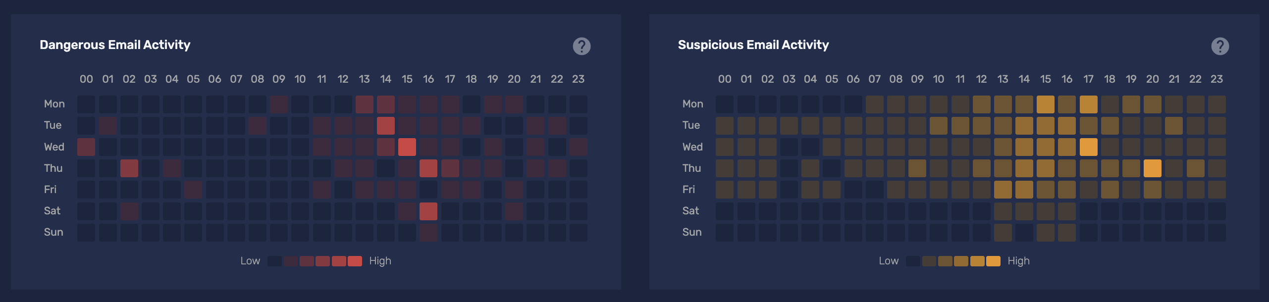
The heat maps display data aggregated by the hour of the day across your selected time period.
- Time Zones: All times are automatically adjusted to your specific time zone.
- Color Scale: The intensity of the color in each block reflects the volume ratio for that specific hour. Darker colors indicate a higher volume of emails received.
- Averages: The data represents averages over the selected date range. Because these are averages, the individual blocks are not clickable and do not link to the Recent Emails page.
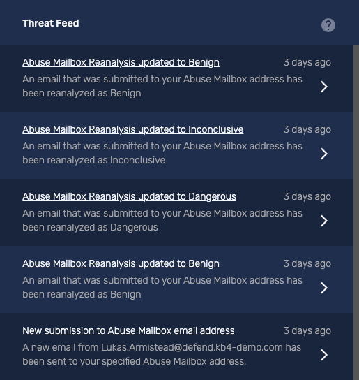
Threat Feed
The Threat Feed displays events related to Dangerous or Suspicious emails and provides a synopsis of activity. For example, 'User has clicked a link in a Dangerous email'.
Select the arrow on the right of the activity to go to a filtered view of Recent Emails for further analysis.
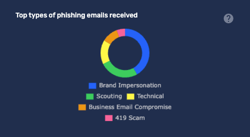
Types of Phishing Emails Received
This graph displays the various types of phishing emails detected by Defend. Clicking on the question mark icon provides more information about the different classifications of emails.
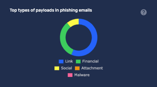
Types of Payloads in Phishing Emails
This graph shows the different types of payloads identified in phishing emails detected by Defend. Clicking on the question mark icon will provide more information.
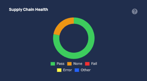
Supply Chain Health
This graph shows the current timeline's DMARC status of all received emails. If your suppliers implement DMARC, it improves their security posture by reducing the risk of their addresses being spoofed. Clicking the question mark icon provides more information about the different statuses.