Web Forms offer a powerful and secure platform for collecting data, enabling organizations to streamline processes and gather necessary information efficiently. The key to creating an effective and user-friendly Web Form requires the right building blocks. This article details the different configurable elements available in Web Forms. We will explore the specific function, available configuration options, and common use cases of each element.
Working examples of Web Forms can be found here: https://example.egressforms.com https://example.egressforms.com (link opens in new window)
Input Element
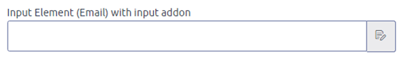
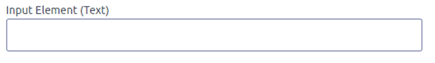
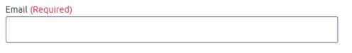
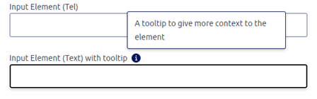
Standard single-line text boxes are used for common inputs like names, email addresses, and telephone numbers. These fields can be configured to check for specific input types to ensure data accuracy.
Text Area
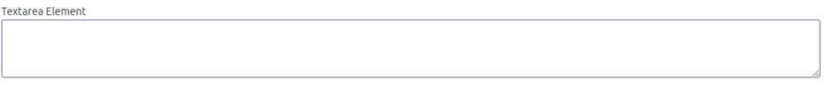
A text area is a multiline textbox. It is commonly used for inputs such as "Tell us about your problem" or "Anything else you’d like to tell us?".
Select
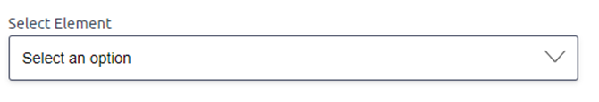
Select elements are drop-down menus that let you choose a single predetermined value from a list, such as a location. These elements can be configured to group values, for instance, grouping employee emails by team.
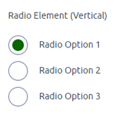
Radio
Radio buttons are used for selections with fewer options where only one choice can be selected. These elements can be arranged horizontally or vertically.
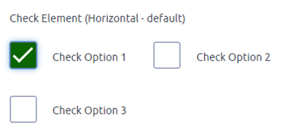
Check
Check boxes are used when multiple values can be selected, such as for disclaimers or lists with fewer options. These elements can also be configured horizontally or vertically.
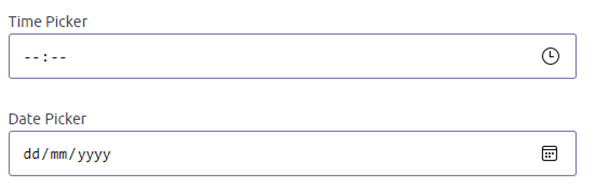
Date and Time Picker
Date and time pickers are used to specify a date, a time, or both. Common uses for these elements include entering a date of birth or an incident date.
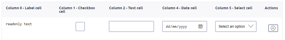
Tables
Tables present multiple values of different types and are commonly used when the number of entries is unknown, such as for family member details. These elements allow users to add new rows using an Add button.
Validation
Validation settings can be applied to any input to make it required, meaning the user must provide a value before submitting the form. This requirement can also depend on other values, such as making an email field required only when the user selects it as their preferred contact method.
Tooltips
Tooltips are icons that can be added to provide a user with more information when hovered over. These elements provide a lightweight way to add context without cluttering the primary interface.
Input Addon
Input addons are icons that can be added to the end of an input element to provide extra functionality or visual context.